· 4 min read
Why Your Website Gets Visitors But No Calls (And What to Fix First)
Traffic without calls is a conversion problem, not a traffic problem. Here is a plain checklist small business owners can use to turn more visits into phone calls, bookings and inquiries.
You open analytics and see people landing on your site. Then the phone stays quiet. Forms sit empty. It feels like the site is working and failing at the same time.
Most of the time this is not a traffic problem. It is a conversion problem. Visitors show up, cannot tell what to do next, or hit a small friction that makes calling feel like work. The fix is usually a short list of plain changes, not a full rebuild.
This guide is for owners who want more calls, bookings and inquiries from the traffic they already have.
First: make sure you are measuring the right thing
Before you redesign anything, confirm two numbers for the last 30 days:
- How many people visited the pages that should produce a lead (homepage, services, contact).
- How many of those visits became a call, form submit or booking.
If visits are healthy and leads are near zero, keep reading. If visits are near zero, fix discoverability first (search listings, Google Business Profile, titles that say what you do). Do not rebuild the site hoping more design will invent traffic.
The five places ready customers drop off
1. The next step is not obvious in five seconds
A visitor should know, almost immediately: who you help, what you do, and how to take the next step. If the first screen is a vague tagline, a slideshow, or a long story with no phone or button, many people leave without deciding.
Fix: Put one clear action above the fold on every key page: Call now, Book a time, or Request a quote. Repeat that same action near the bottom. Use the same words every time so the site feels decisive, not busy.
2. The phone number is hard to use on a phone
Most local searches start on a phone. If your number is an image, plain text that is not tappable, or buried in a footer, you lose the easiest win on the page.
Fix: Make the number a real tel: link. Put it in the header on mobile. Keep the same number on your site and every directory listing so people who check you twice see a match.
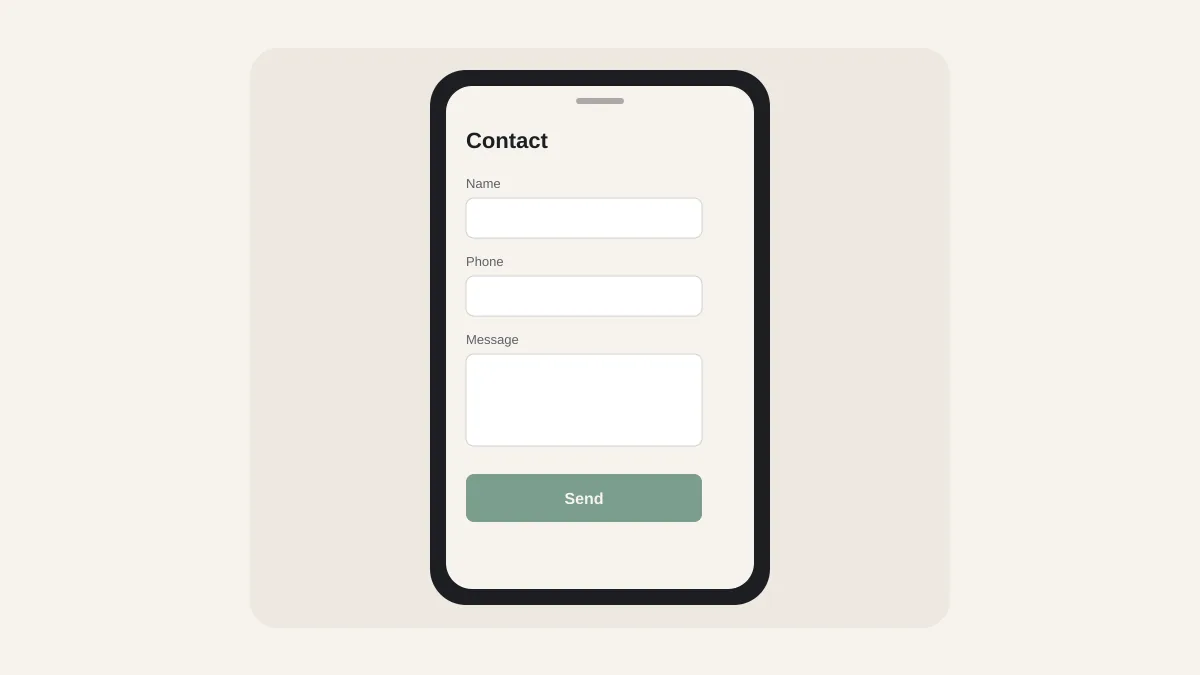
3. The form asks for too much, too soon
Long forms feel like homework. Name, email, phone, company, budget, timeline and a paragraph about the project is a lot when someone only wanted a quick answer.
Fix: Cut the first contact form to the minimum you need to reply: name, contact method, and one short question about what they need. Offer a phone call as an equal option next to the form, not as an afterthought.
4. Trust is missing when they are ready to act
When someone is about to call, they scan for proof: real work, a real person, clear next steps. Stock photos, anonymous copy and no examples make the call feel risky.
Fix: Show finished work with plain outcomes (more inquiries, easier booking, clearer offer), not jargon. Link to a short about section with a real photo of the person they will talk to. Keep reviews and names only where you have permission.
5. The page talks about you instead of their decision
Owners often write the site they wish they had: history, process, awards. Buyers are deciding whether this business can solve their problem this week.
Fix: Lead with the problem they searched for, then the outcome, then how you work. Put company story after the call to action, not before it.
A 30-minute audit you can do today
Open your homepage on your phone (not your laptop) and time yourself:
- Can you find the phone number or booking button in under five seconds without scrolling?
- Does the first sentence say who you help and what you do?
- Is there one primary action, or three competing ones?
- Does the contact form fit on one screen without zooming?
- After you tap Call or Submit, do you land somewhere that confirms what happens next?
Any "no" is higher leverage than a new color palette.
What good looks like, in practice
A site that turns visits into conversations usually has:
- One primary action repeated in the header and near the end of each key page
- A tappable phone number that matches your public listings
- Short forms plus a clear booking or call option
- Real examples of finished work, linked from the pages that get traffic
- Contact confirmation that sets expectations (when you reply, what to prepare)
You can see how we shape that path on live client sites in our case studies, including zohracodaymusic.com and selfdiscoveryhaven.com.
When a redesign is worth it
Fix the five drop-off points first. If the structure, navigation or offer is still confusing after that, a redesign can help because you are rebuilding around the action you want, not around a new look.
If you want a second pair of eyes, we offer short website audits that rank fixes by impact on inquiries. Every build ships with a care plan option so the site stays current after launch.
Want help applying this to your website?
A free 30-minute call. We'll look at what your site needs and what it doesn't.